Data visualization is a good way to inform pedestrians about their cities and it could make a huge difference between good and bad citizen decisions.
It´s important to explore how can we take relevant information to the city but In most cases, sadly, the answer is the computer.
There is a big opportunity not just in displaying information around the city, using it as a huge canvas, but in install data collecting devices to understand what citizens want, think and dream about their cities. How people interactions change in the city using data interventions? Why is important to change or at least amplify the way we tell data stories and how the data experience is maximized when it is displaying in an unusual spaces?
Today, the visualization discipline has made a huge emphasis in computer. Software development, a lot of numbers and complex programming are immediately associated to data visualization. But it could affect negatively the discipline. Often visualization specialists forget It´s not about making information visualization, It´s about make information visible. It seems to be a complicated discipline but it is because they centered the speech in the machine instead of the information itself. Visualization experts somethimes forget the heart of visualization: make ideas clear, clarify concepts and change minds. To make a great visualization you don´t need a computer, you just need your head and your hands.
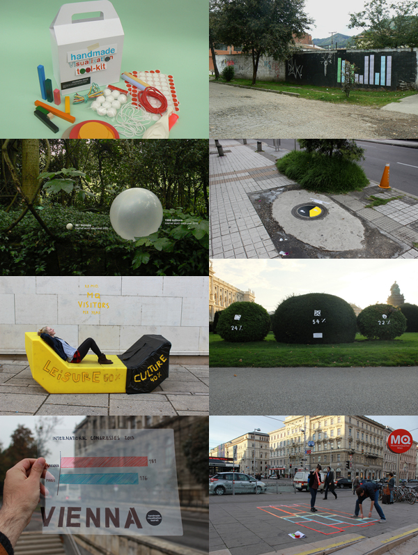
Analog representations and urban data interventions becomes a mediation instead a simple instrument. It generates an experience between observer and information. Statistics aren´t something you can touch, turning them into abstract physical shapes can help to understand data and more important, have a new and relevant experience with it.
Biografie von Jose Durarte
Jose Duarte is a Colombian information designer, magister in communication and visual storyteller.
Unlike most of the infographics we see today, his data visualizations aren´t high-quality computer-aided; they´re handmade using simple items like balloons, tape and ruber balls. Using ordinary materials he has experimented with various visualization techniques from area charts to bubble graphs and ven diagrams in diverse scenarios as business, art, street interventions and even astronomy.
Now, he is exploring simple ways to visualize information quickly and easily and his work – particularly the handmade visualization toolkit and the #easydataclip project – has inspired and encouraged people to approximate to data visualization for the very first time.
His work has been published by Gestalten´s book Visual Storytelling and Promopress´s Infographics: designing and visualizing data and has appeared in world wide specialized magazines and blogs as Owni, Marie Claire, infoaesthetics, brainpickings and Co.Design among others.
He has made infoviz conferences and workshops in Colombia, Mexico, USA, Germany, Austria, Italy, Netherlands, Belgium and Slovakia among others.